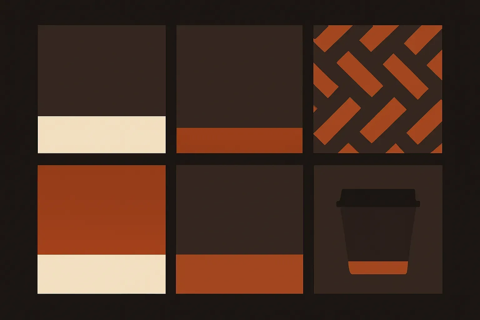
Wren & Oat Coffee Roasters
Challenge
A hypothetical coffee roastery needed an identity that could survive being printed on a bag, embossed on a cup sleeve, and displayed on a point-of-sale screen — three very different surfaces, one mark. The brief: build the identity, then prove it holds together as a system, not just a logo.
Approach
The mark and type system were built first under the Full Identity System scope, then extended into a small design system — documented color and type tokens, packaging layout rules, and POS screen components — to show how a brand-new identity and a design system pair naturally once a business starts producing physical and digital touchpoints at the same time.
Outcome
A 40-page brand guide plus a documented token and component set — the identity and the system built to move together as the business grows past its first product run.